Author: McKenna Carpenter
-

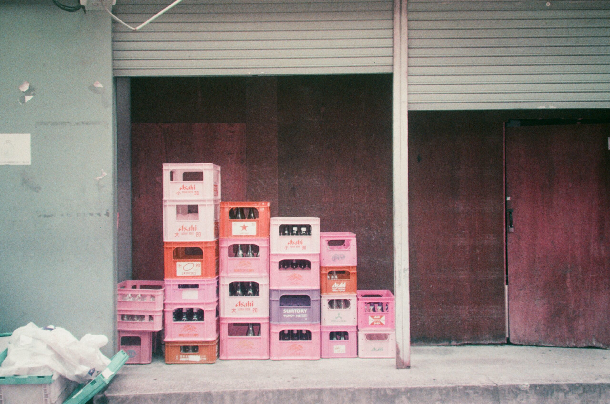
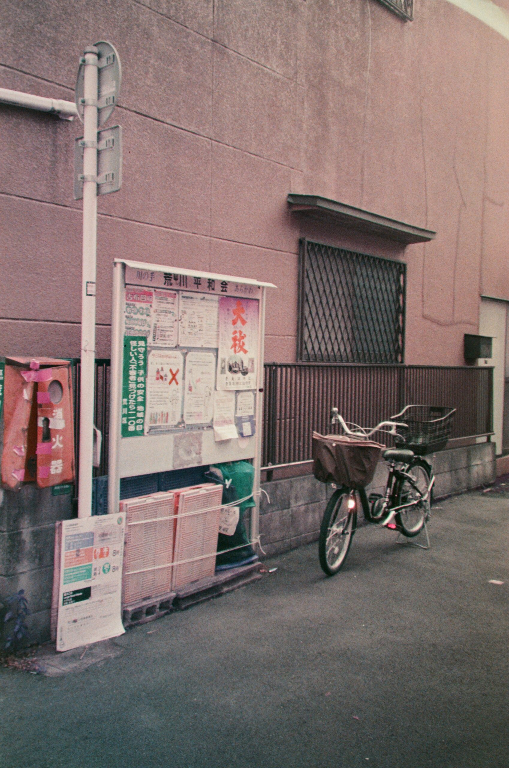
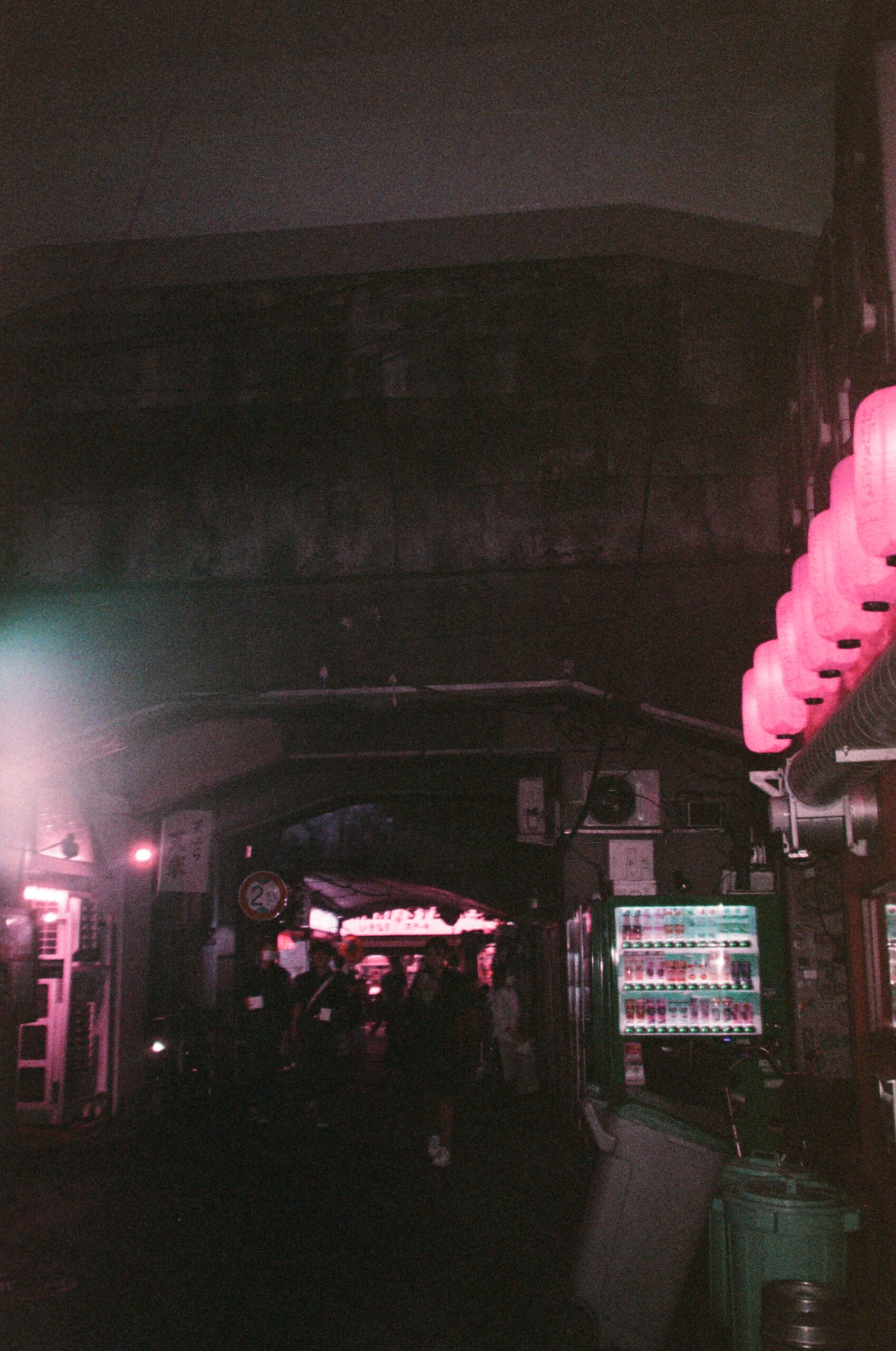
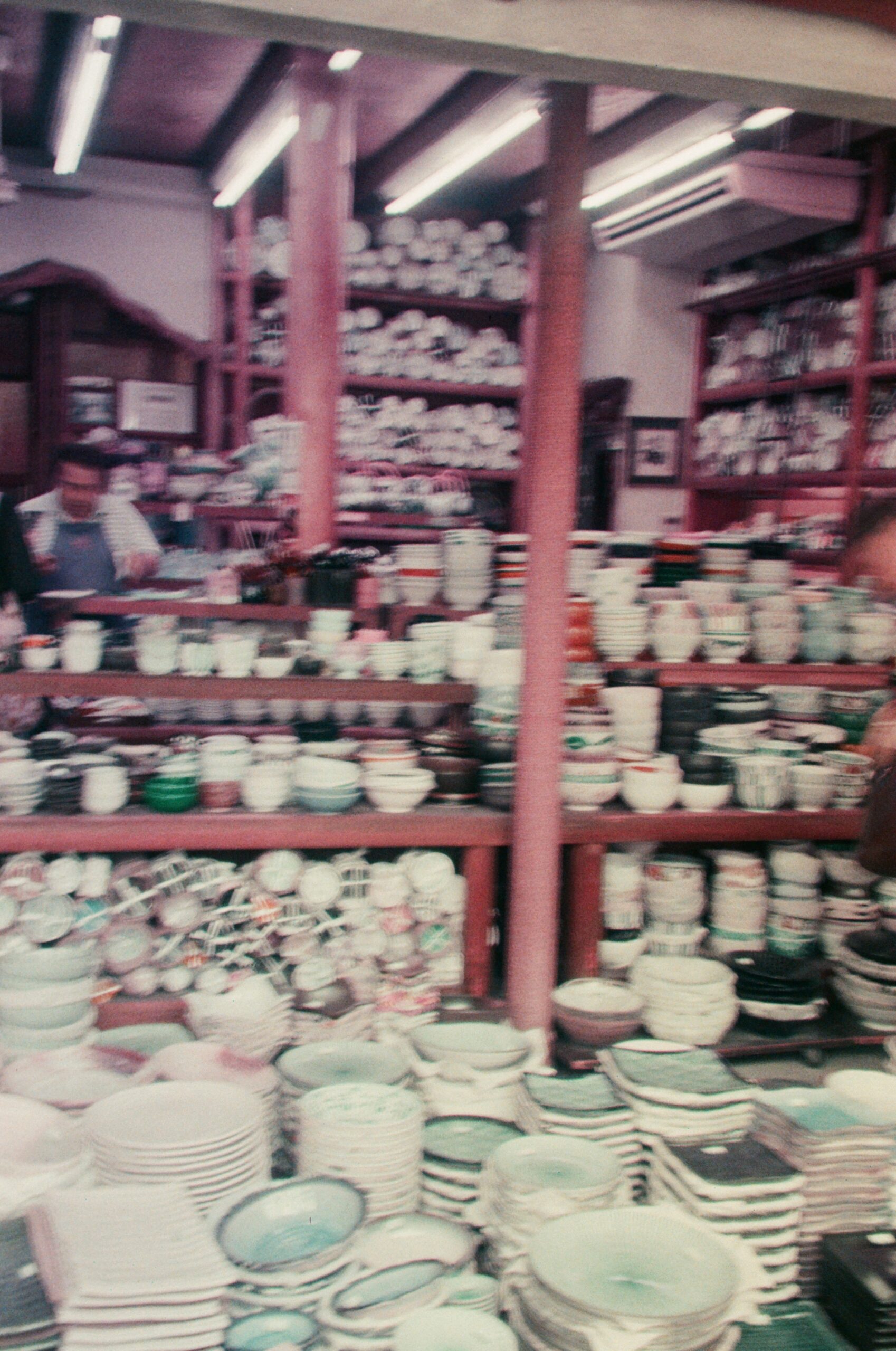
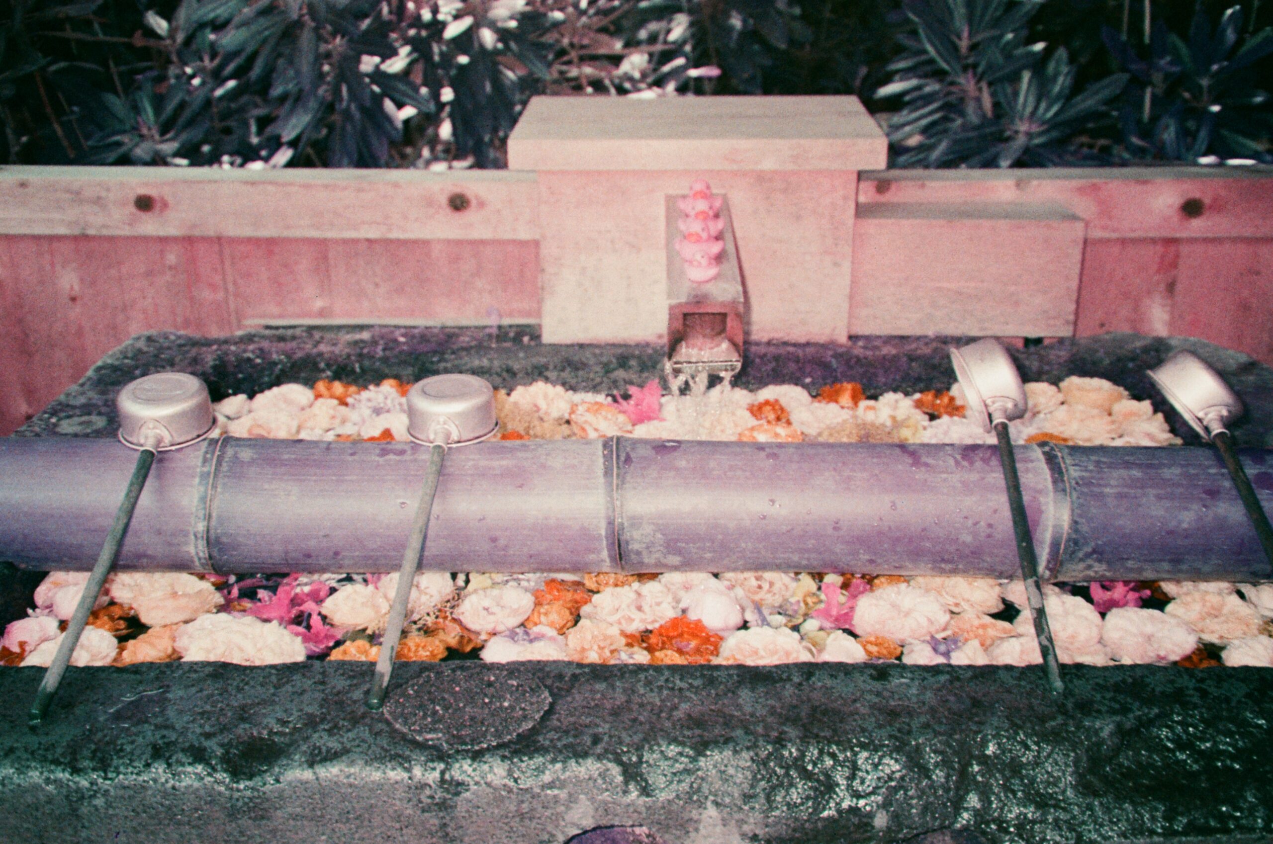
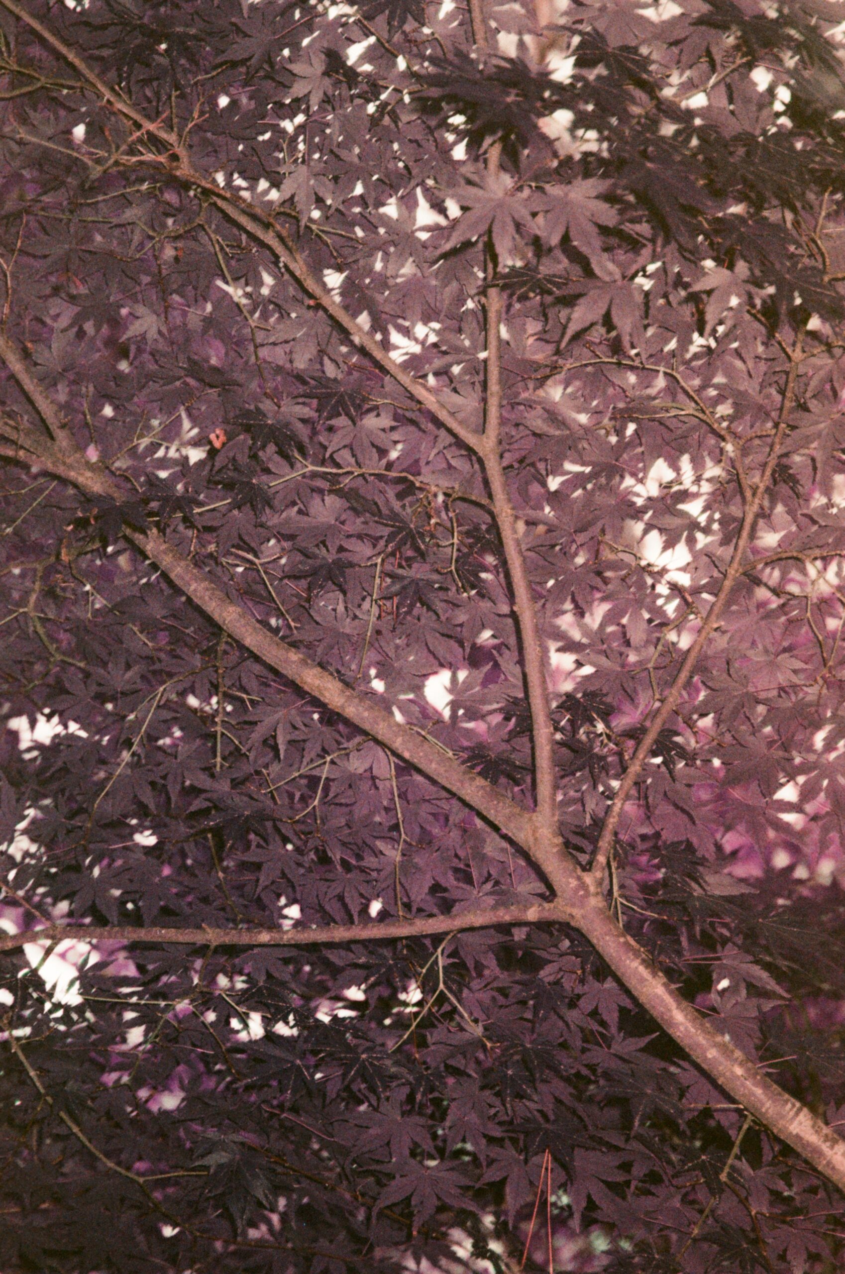
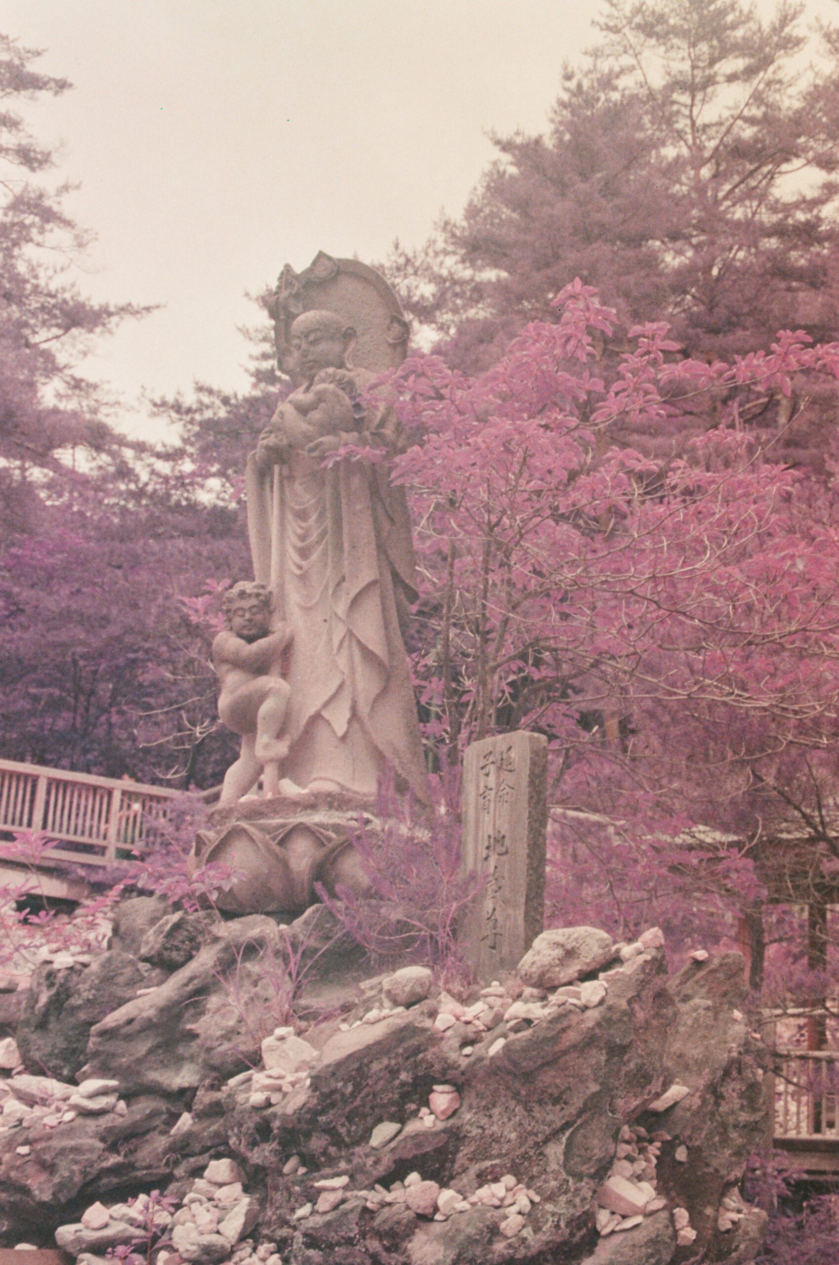
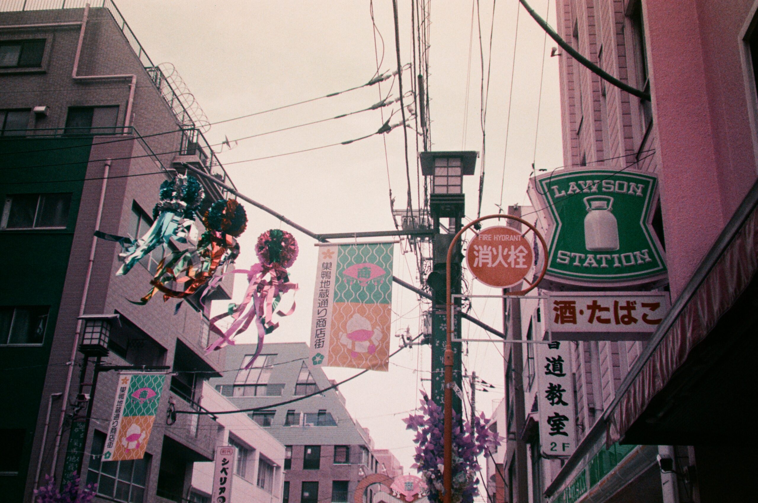
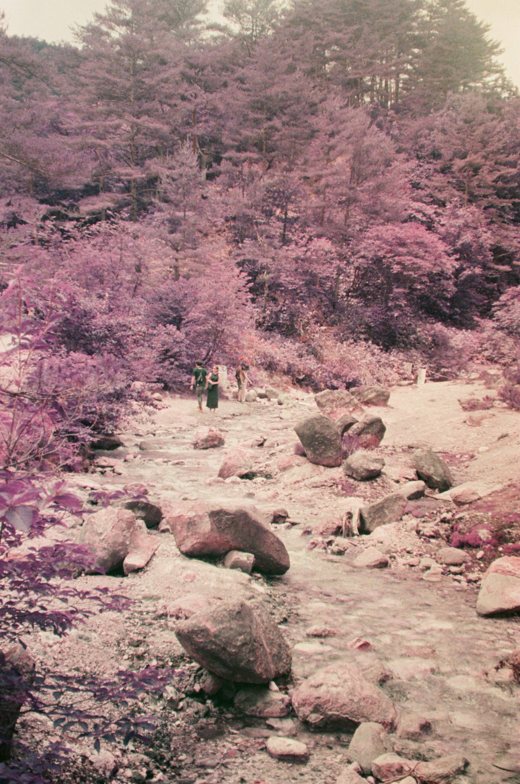
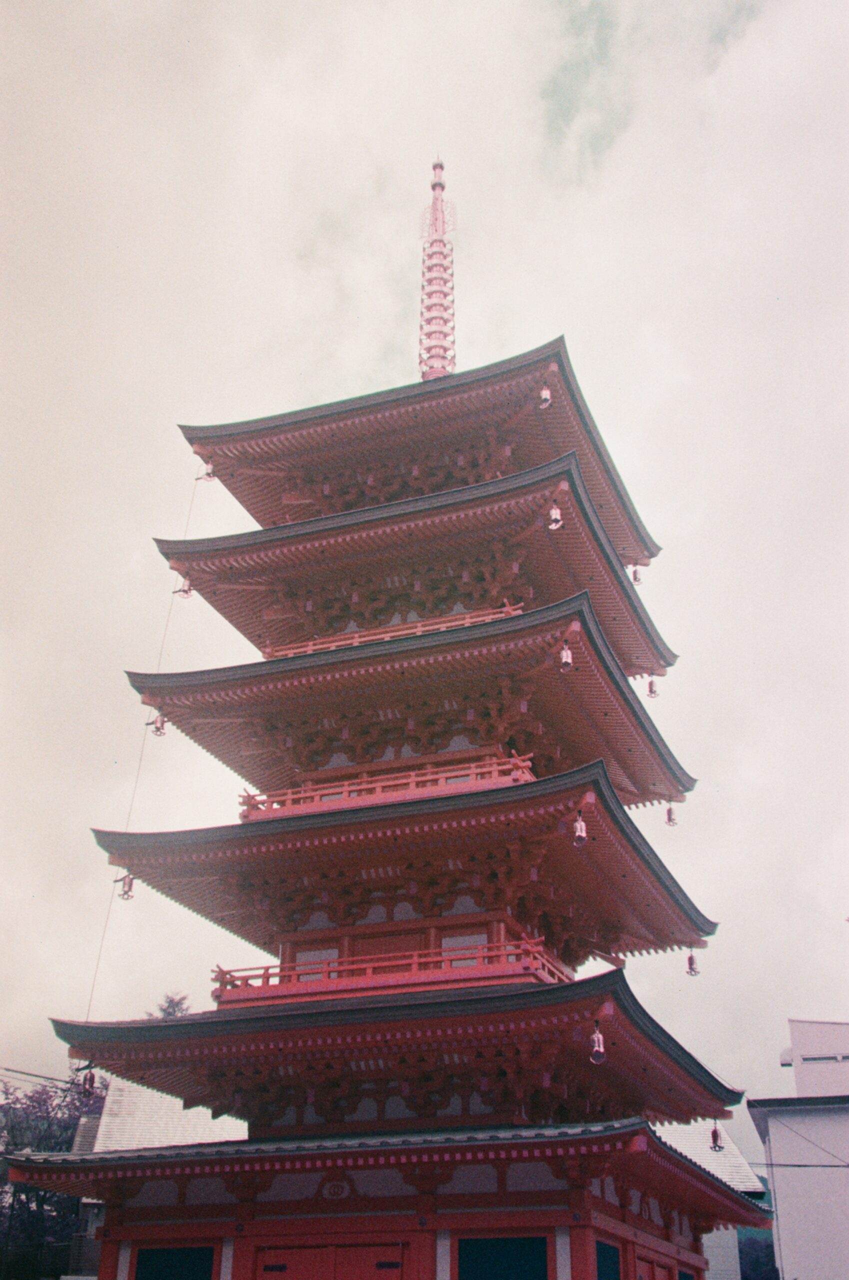
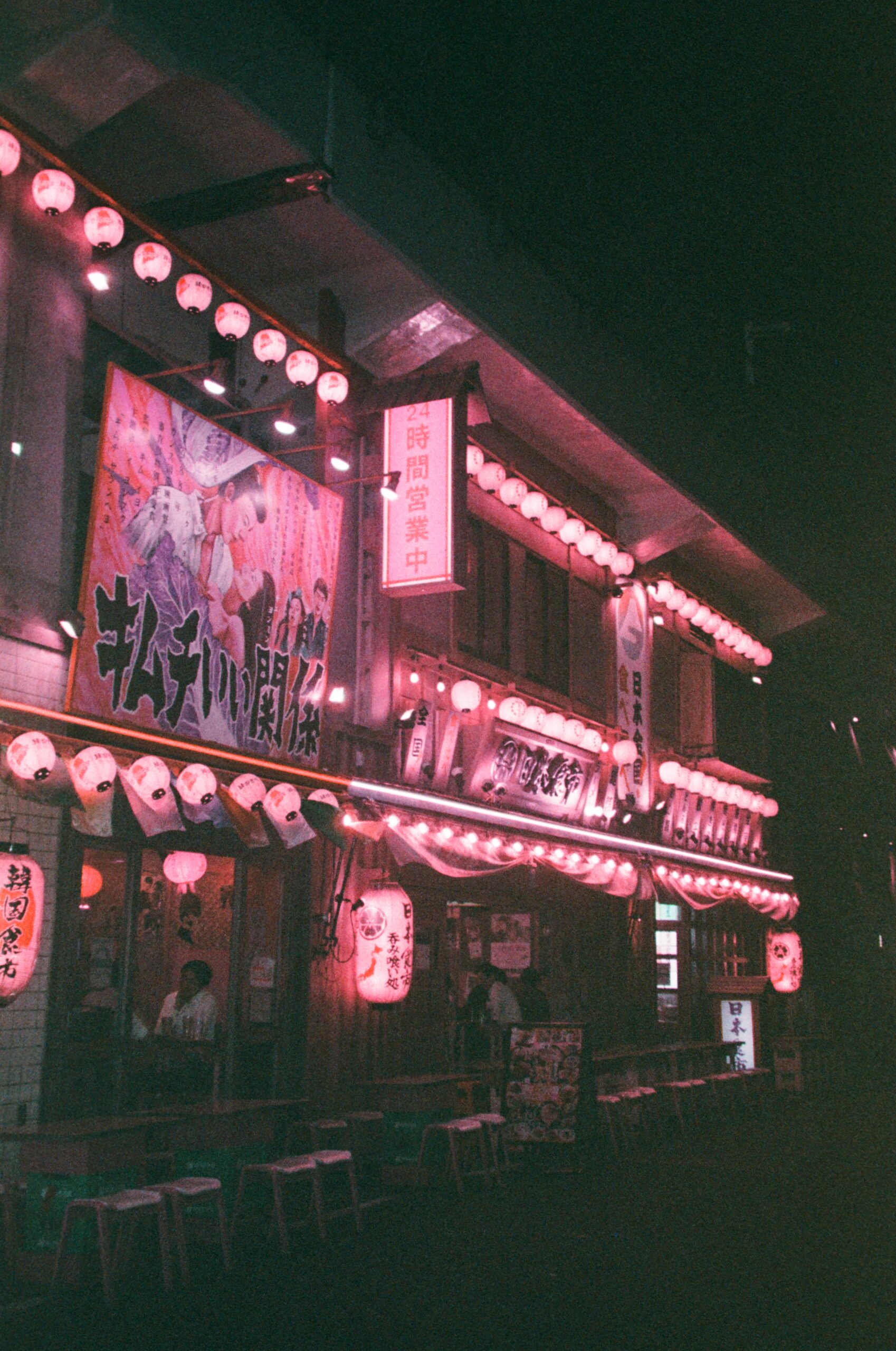
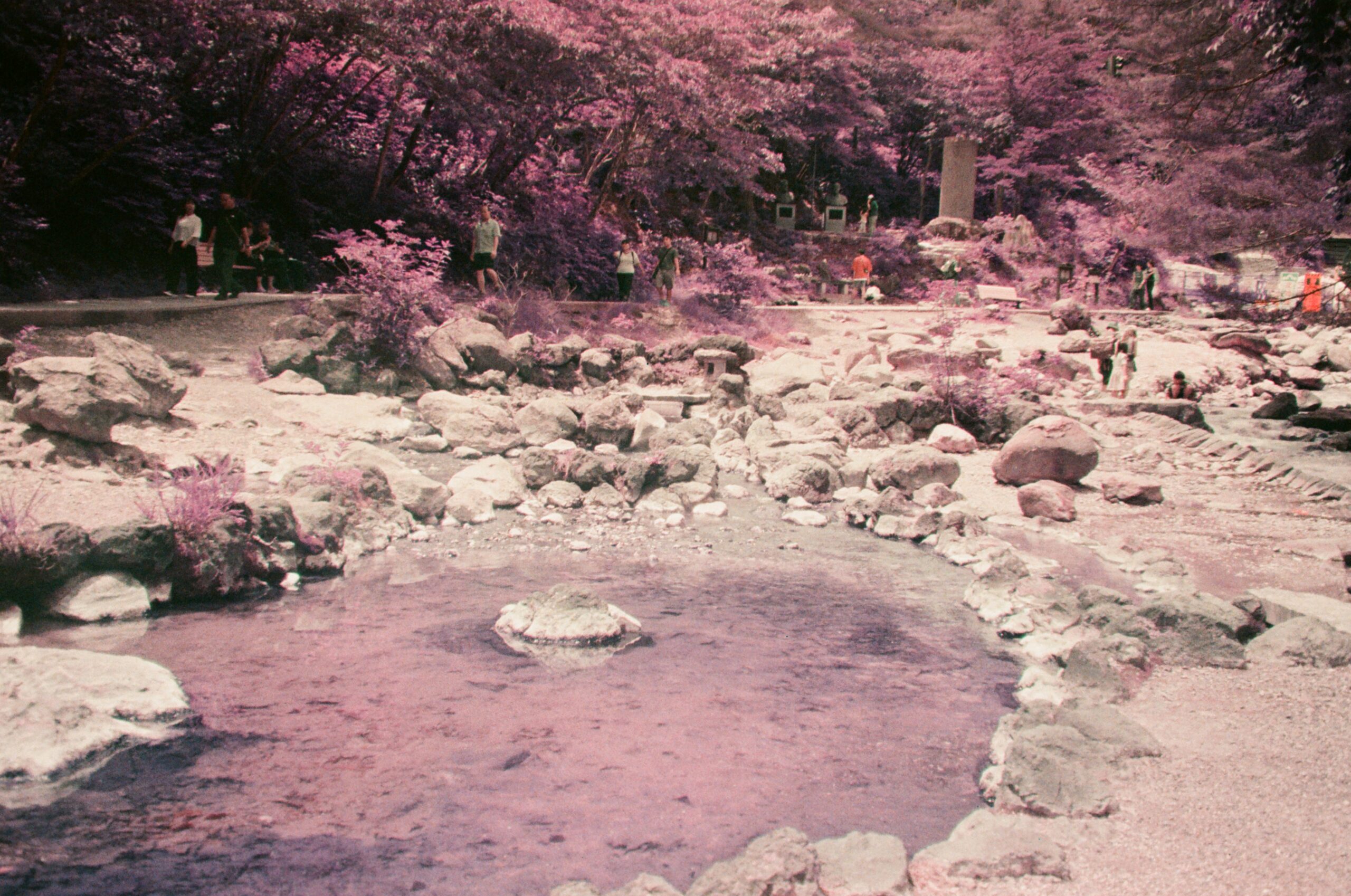
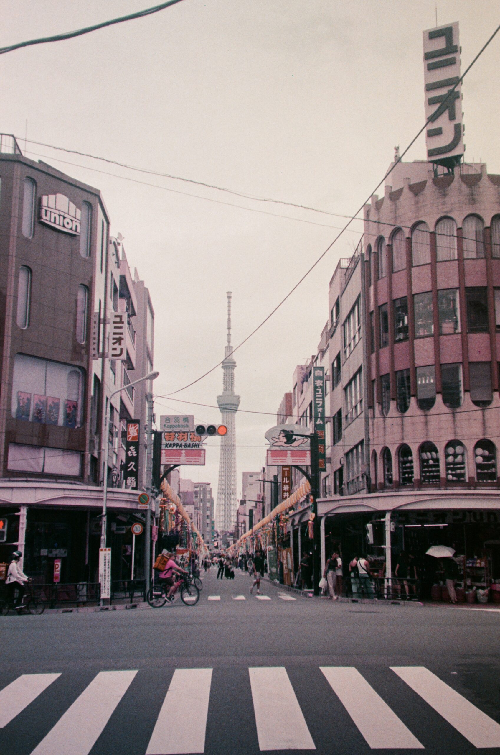
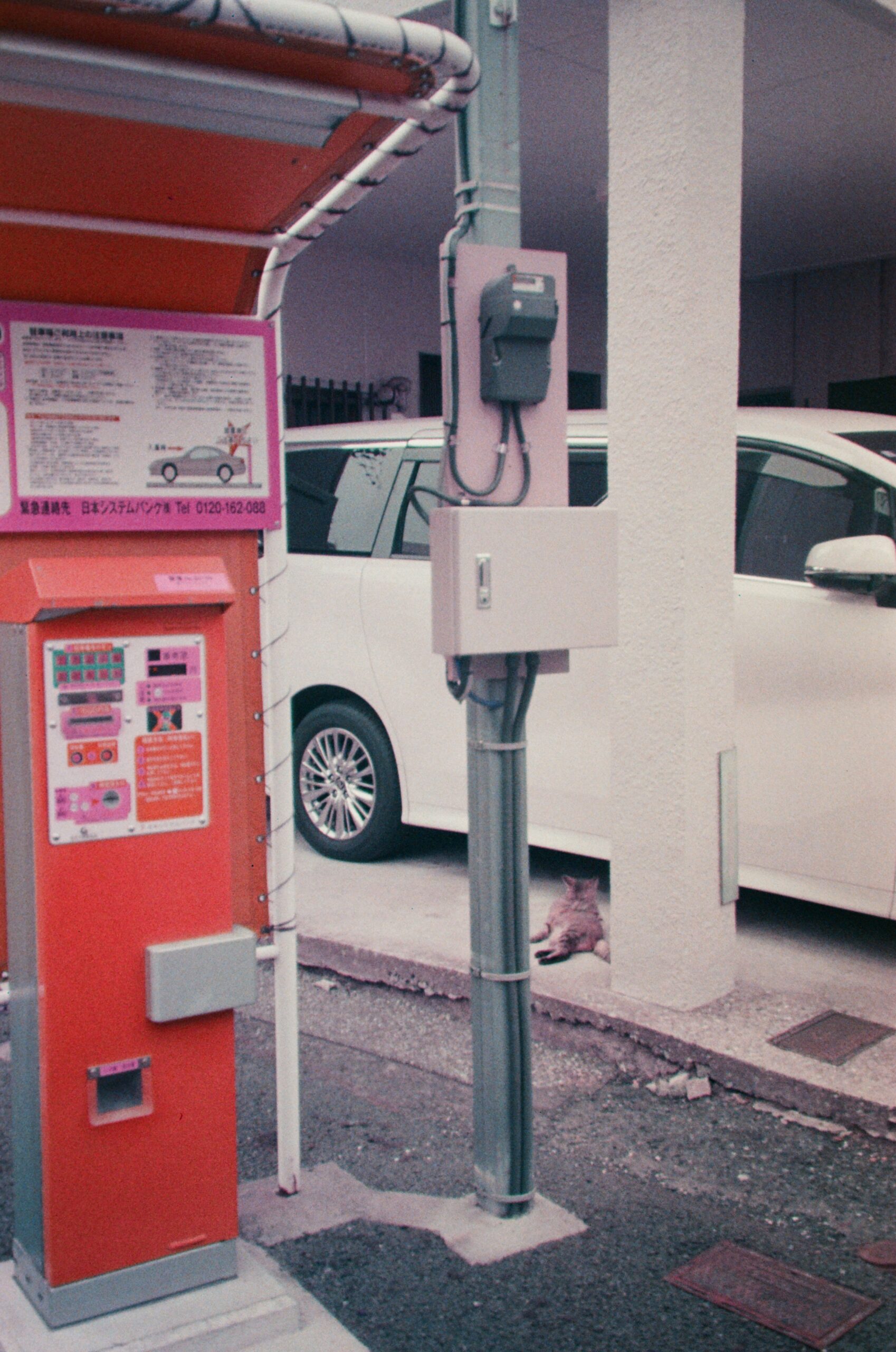
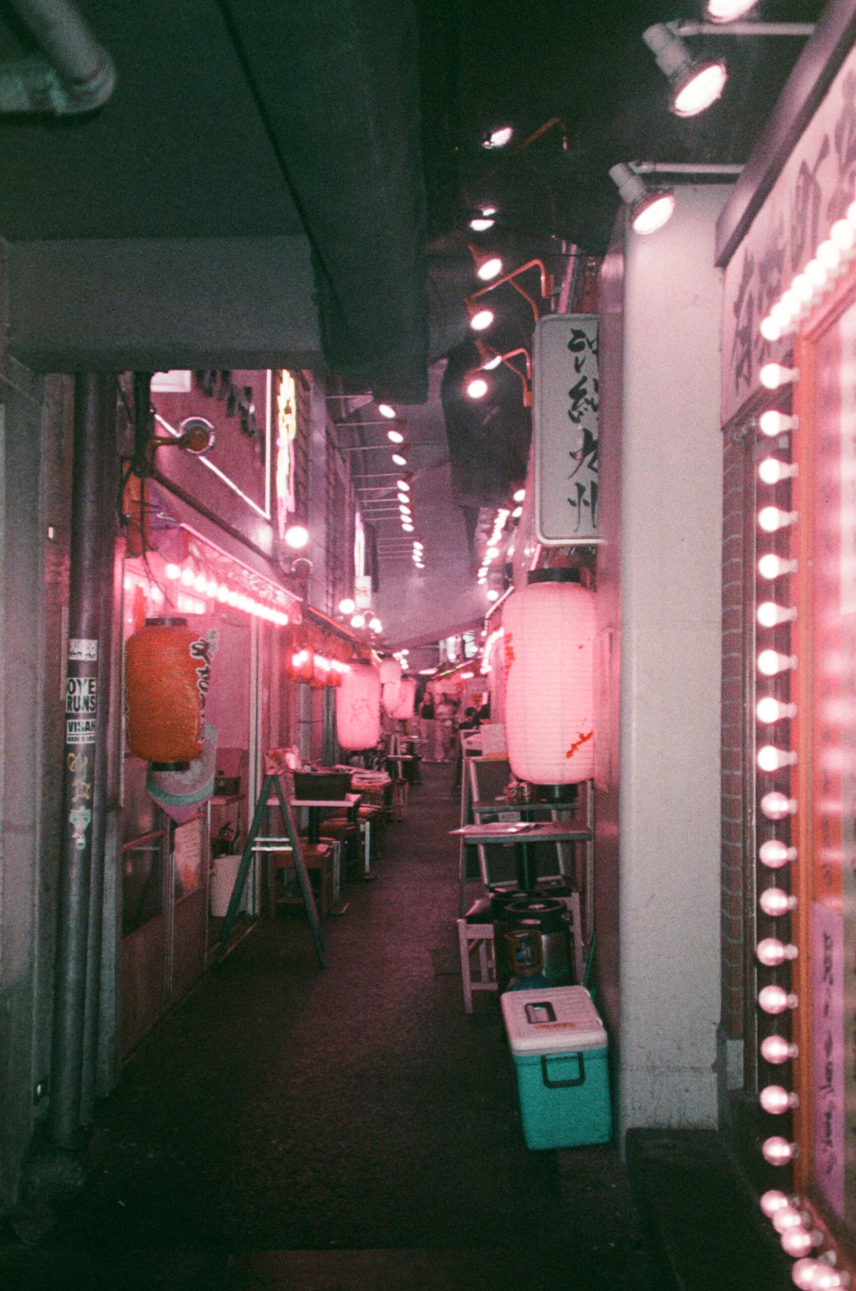
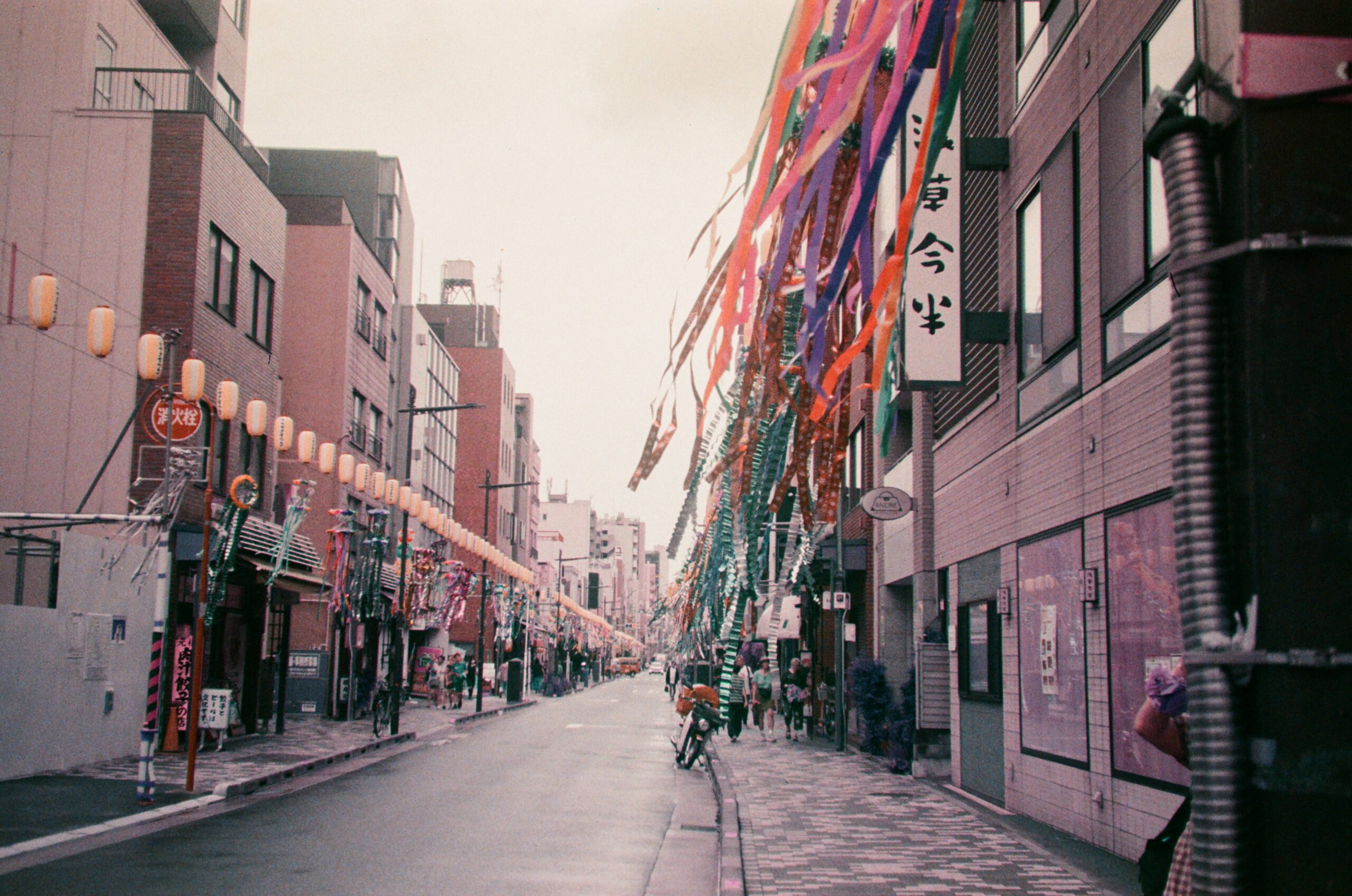
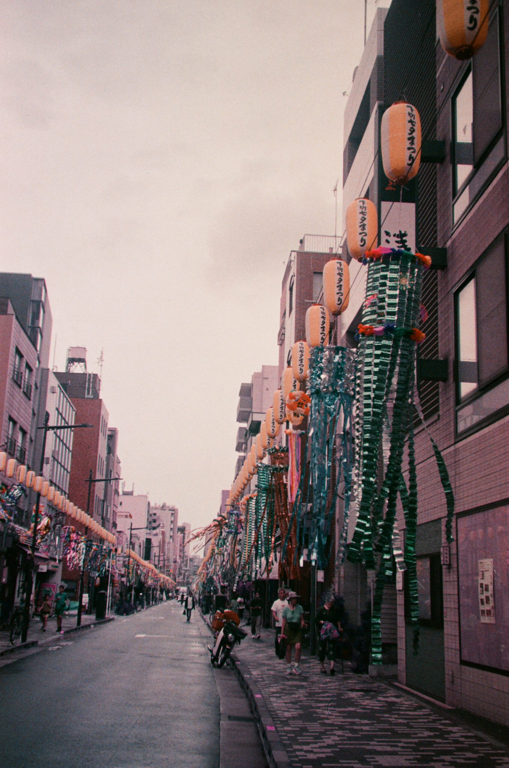
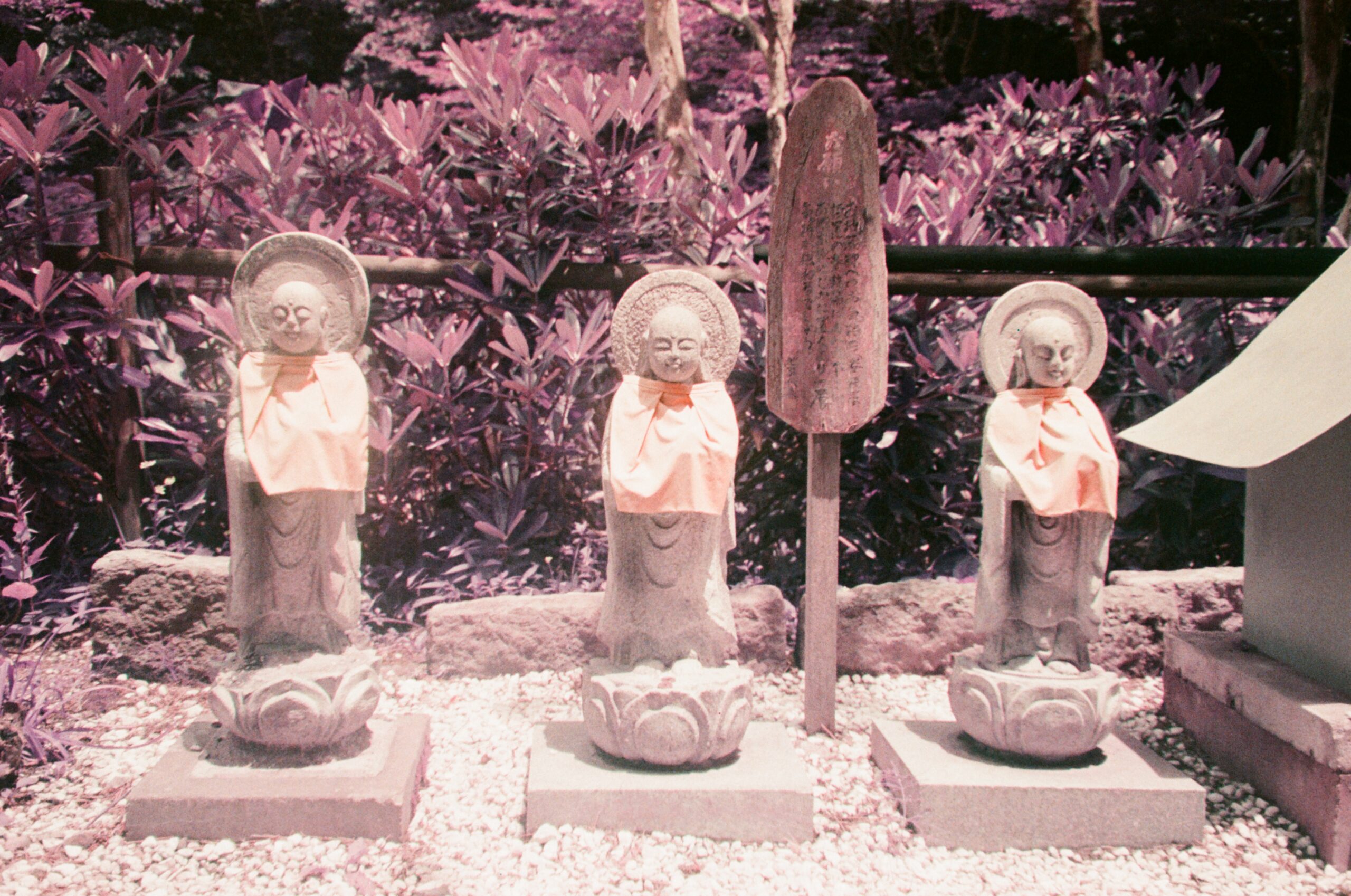
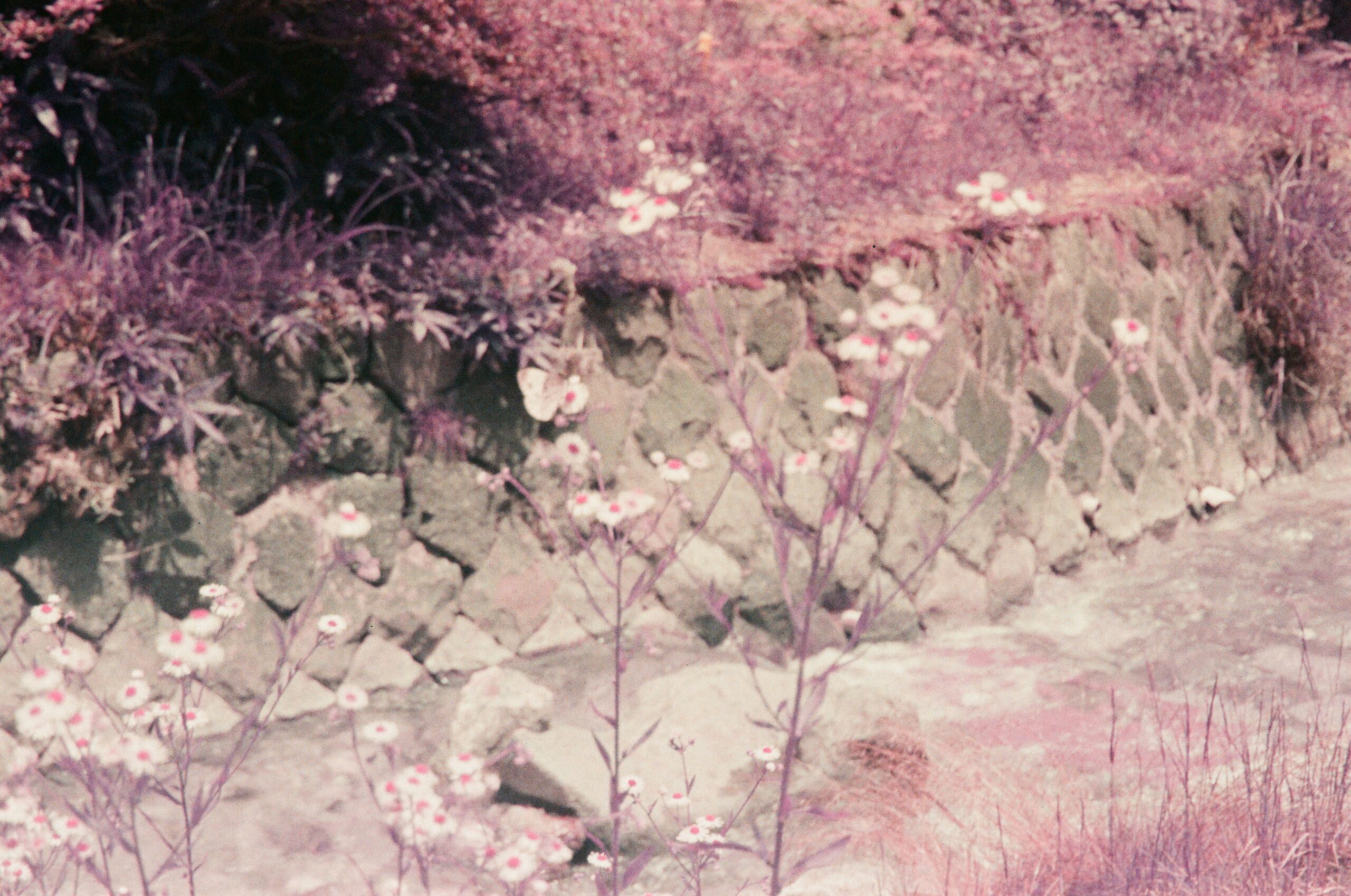
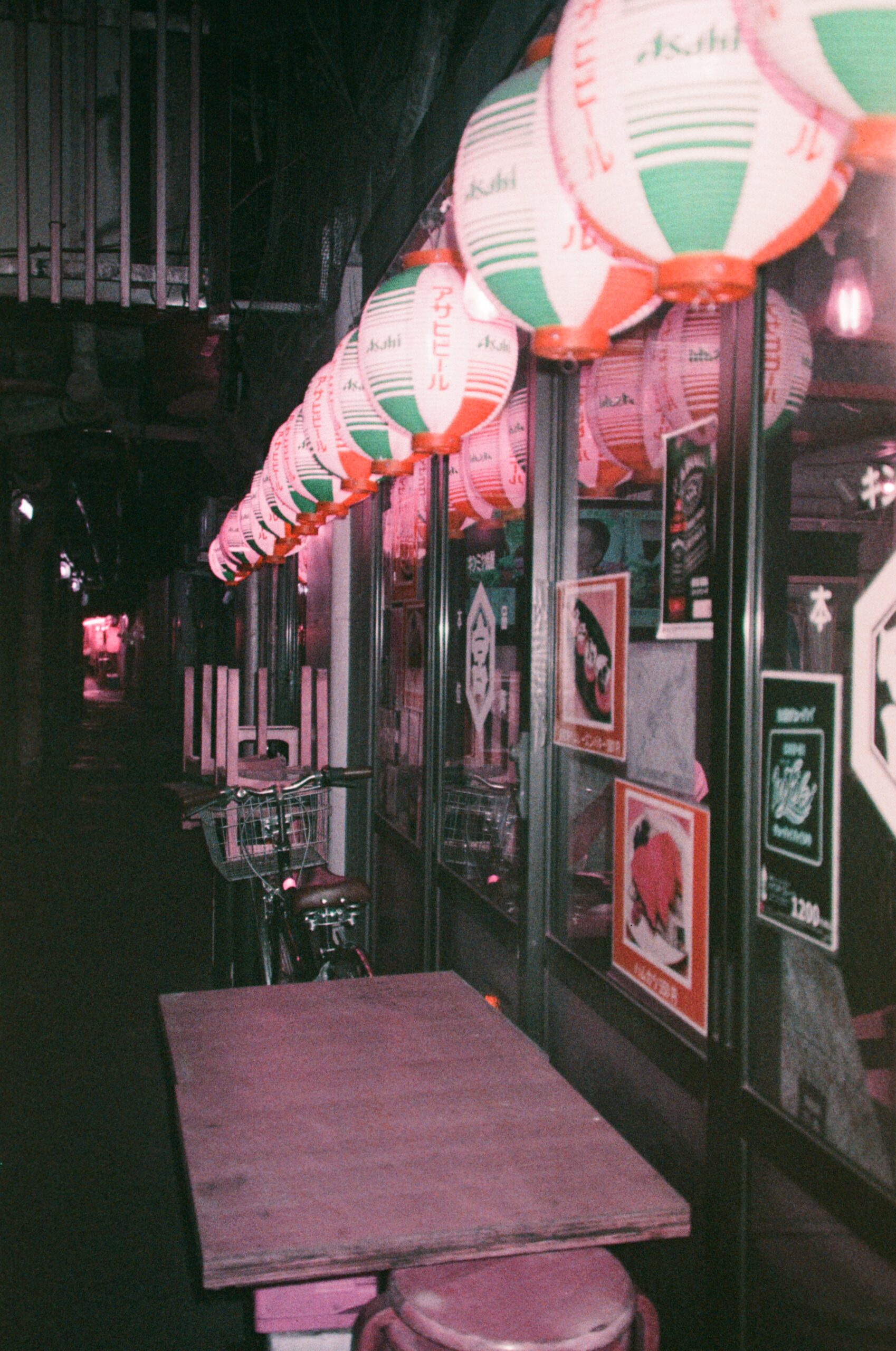
Photos from Tokyo, 2024
Shot on Pentax Zoom 90 WR (1991) with Lomography 2021 LomoChrome Purple Petillant Film
-
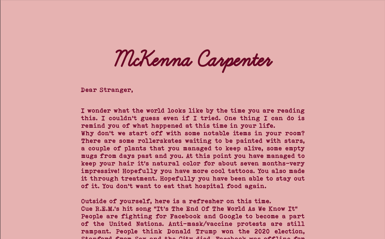
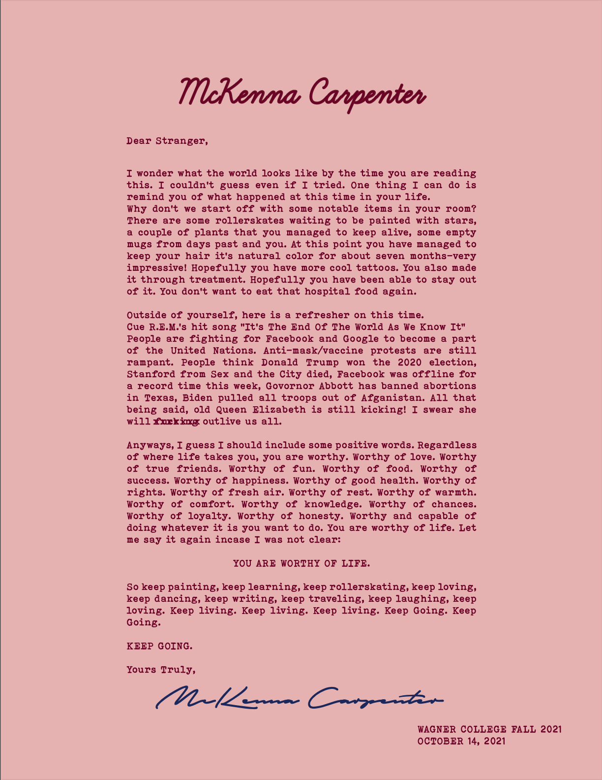
A Letter to My Future, 2021
This semester I am taking a graphic design course. I am not experienced at all when it comes to digital art but it has turned out to be a lot of fun. I really admire my professor’s work and the media she shares with us. I am currently working on a project based on an article that SSENSE.com recently published called “Letters to the Future.” The article showcased letters written by artists, designers and celebrities for their future selves. The letters featured their custom letterheads and unique design elements. One of my favorite writers/bloggers and the mother of what was Rookie Mag, Tavi Gevinson, was featured! I have always been very inspired by her eclectic style and trailblazing articles. Anyways, I have decided to post my projects on here for my own documentation and viewing pleasure.
-
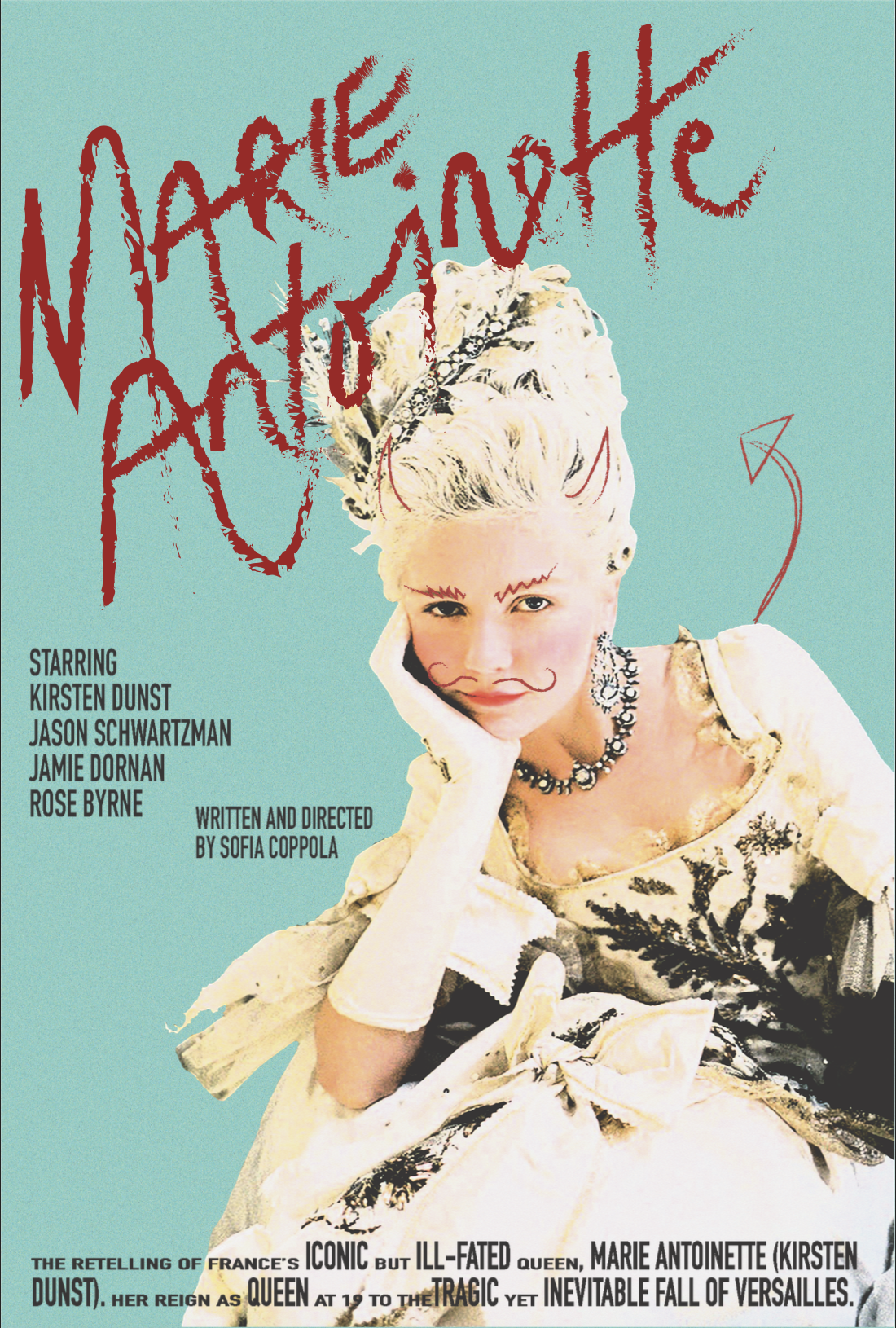
Movie Poster Re-Work: Sofia Coppola’s Marie Antoinette, 2021
During the fall semester of 2021, I was given the assignment of re-designing a movie poster that piqued my interest. Given my love for the works of director, Sofia Coppola, I chose one of her most iconic films, Marie Antoinette. The original design features opulent colors like fuchsia and robin’s egg blue. The main focus of the work is a photo of the lead actress, Kirsten Dunst, dressed in traditional Rococo fashion.
The main objective for the assignment was to identify the key features of the original work and pull inspiration from them in the re-design.
For my design, I chose to lean into a more comical theme. I was inspired by the idea of marking up a classmate’s yearbook. One example could be the “Burn Book” from the film Mean Girls which features photos of students that have been defaced with pens and markers. The inclusion of the red marking’s over the photo not only adds humor to the piece but also provides historical context. As we know, Marie Antoinette was a martyr during her time and it is hinted at in the devilish caricature overlayed on her photo.
For the typeface, I wanted to find something that would contrast with the red, serif title text but hold a similar weight. I decided on a bold, sans-serif typeface and used only uppercase letters which mimics the text of an older movie poster style.
-
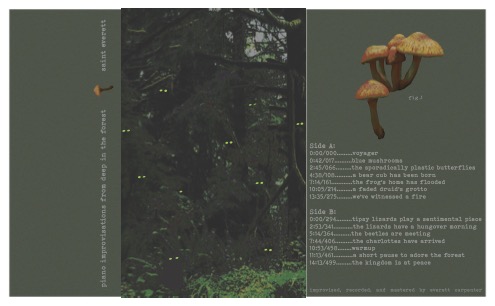
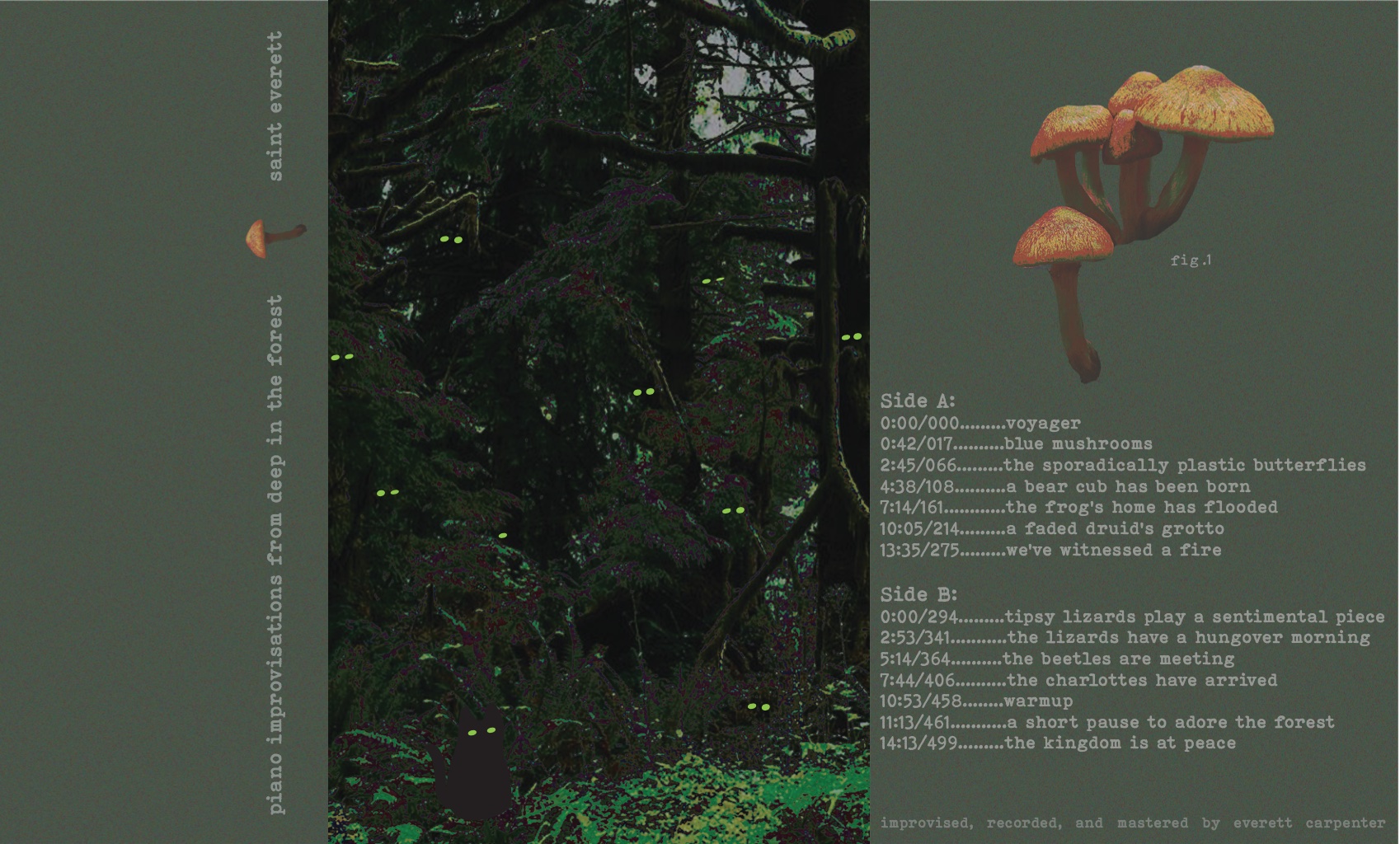
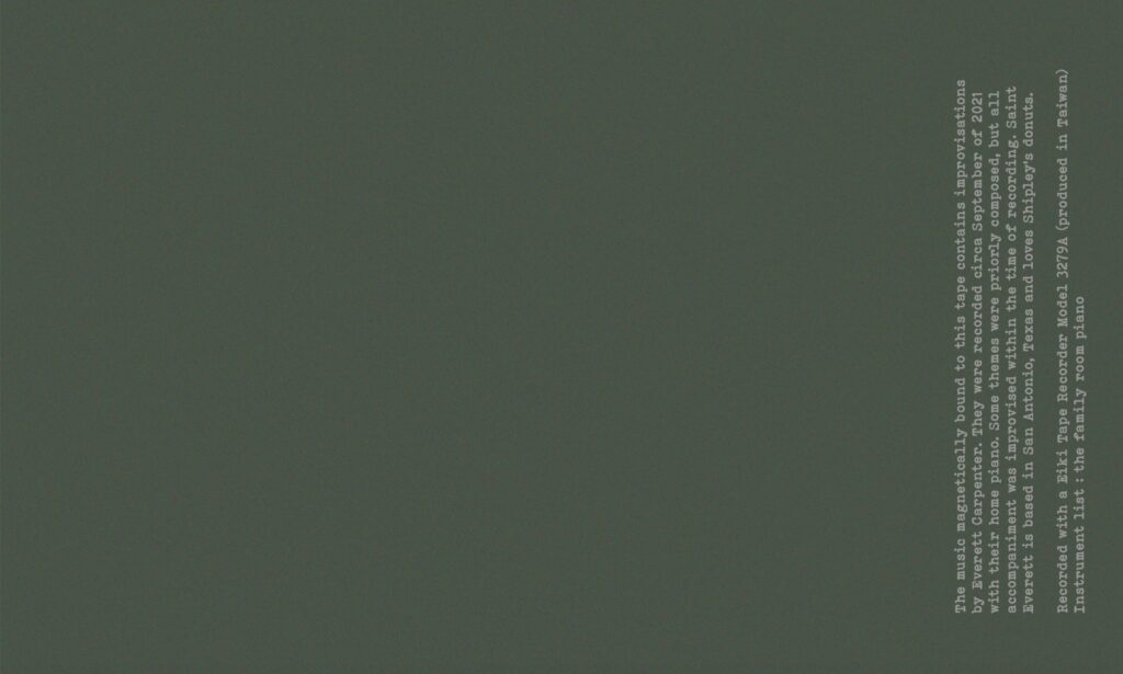
J-Card Design: Saint Everett, 2022
I was presented with the opportunity to create the visual identity for first album release by artist and friend, Saint Everett. I was given the track list and the album name as a sort of jumping off point for the design process. Through these materials I developed imagery that would best suit the theme of the album. The album was named “piano improvisations from deep in the forest” which led to the initial idea for the front panel of the J-card. I decided to use a photo from the US National Parks Department’s archives as a starting point for the design. The artist and I knew we wanted to incorporate a personal detail into the design which is where the idea for the black cat came from. The black cat is representative of the artist’s pet and holds significance in the album. To continue the forest theme, I created transparent overlays of mushrooms to embellish the back and side panels. This design was created with Adobe InDesign, Illustrator and Photoshop.
-
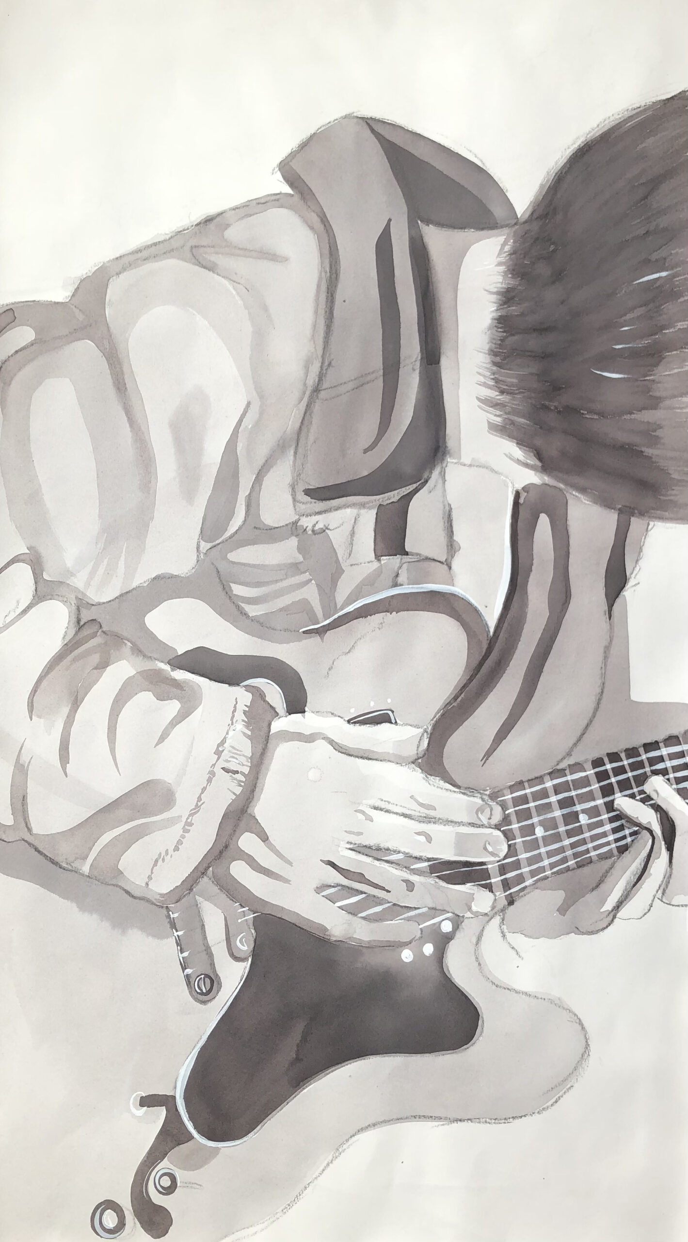
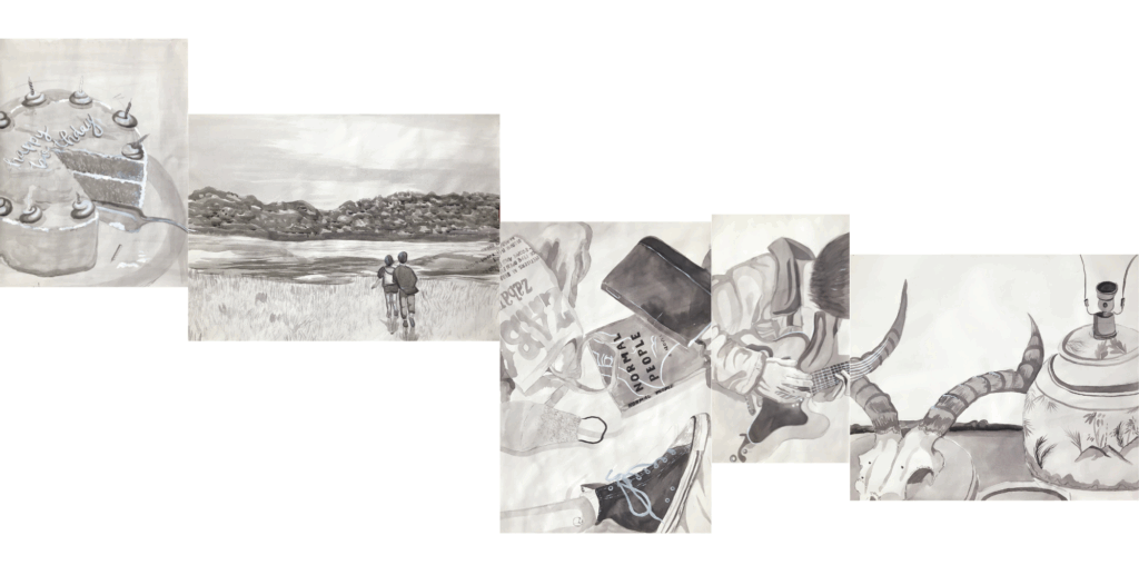
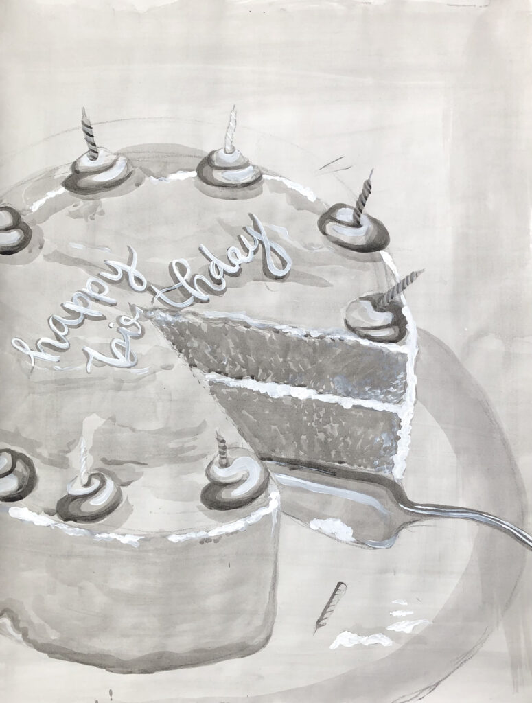
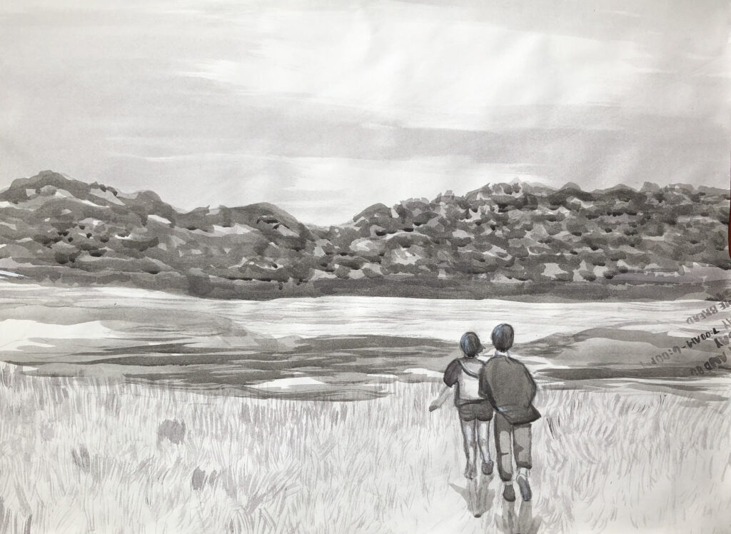
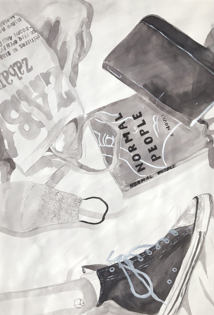
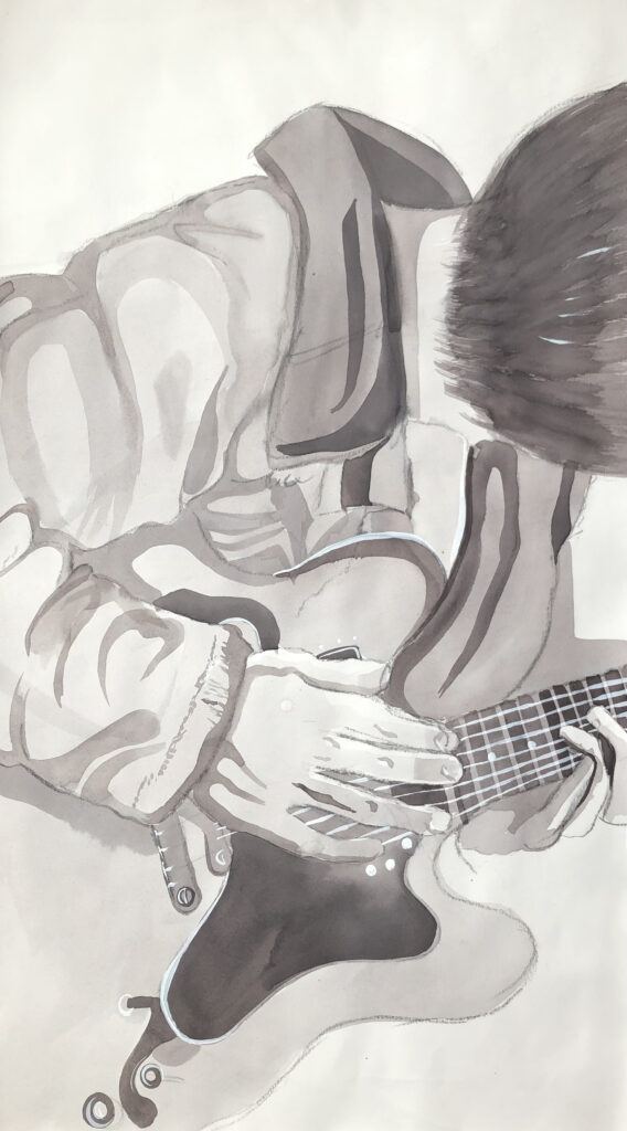
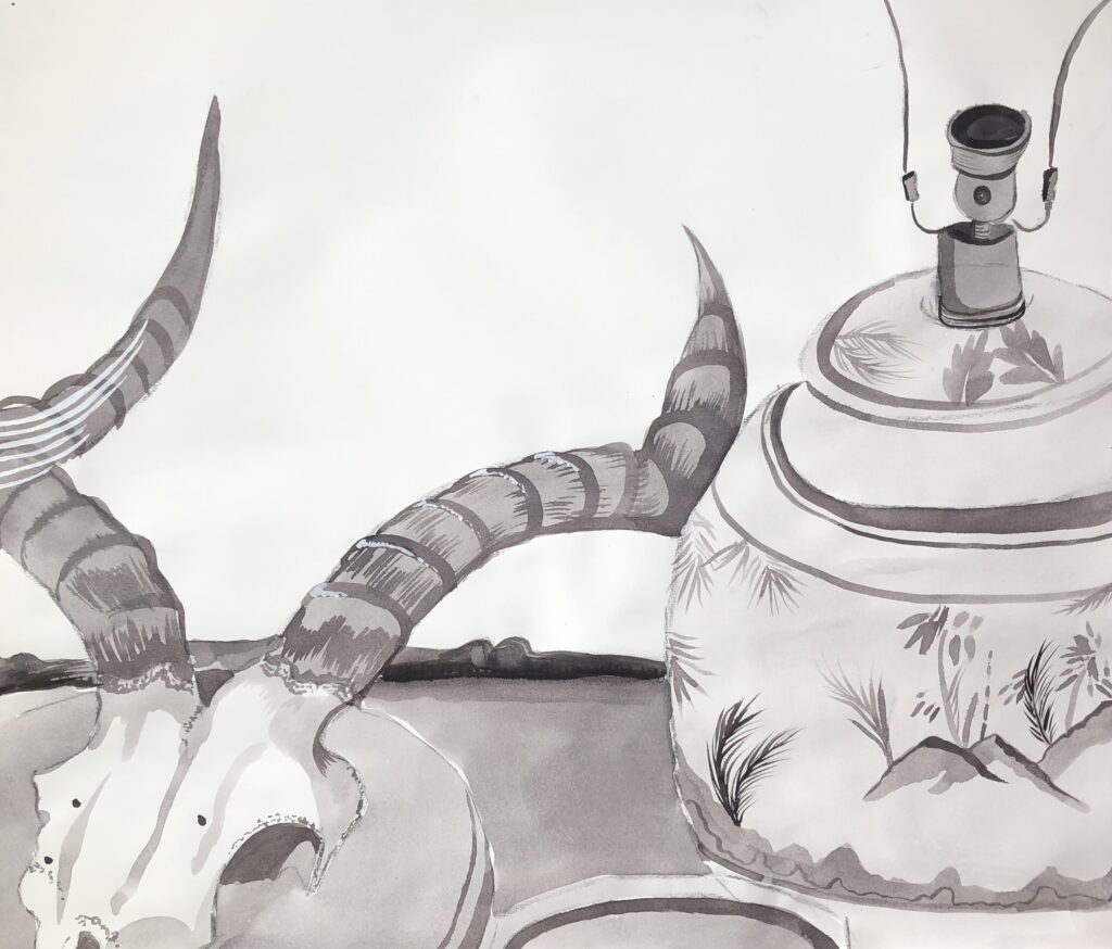
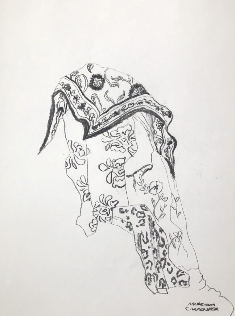
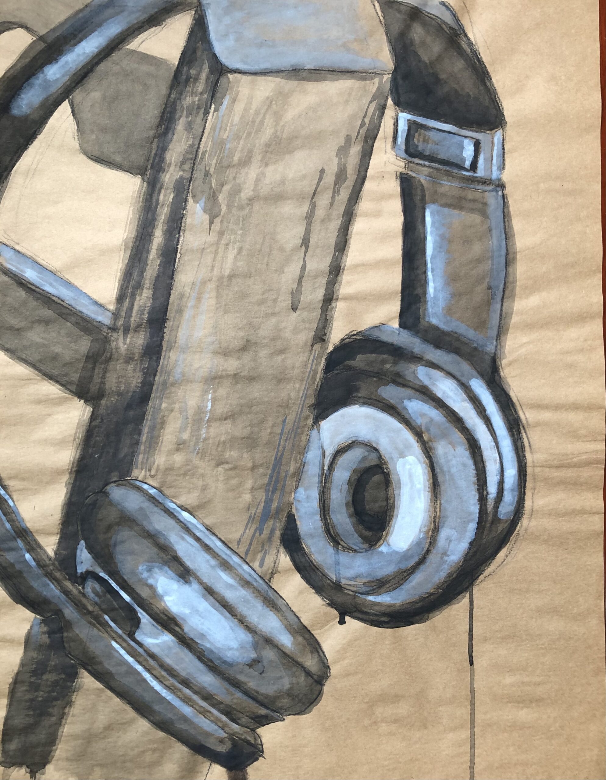
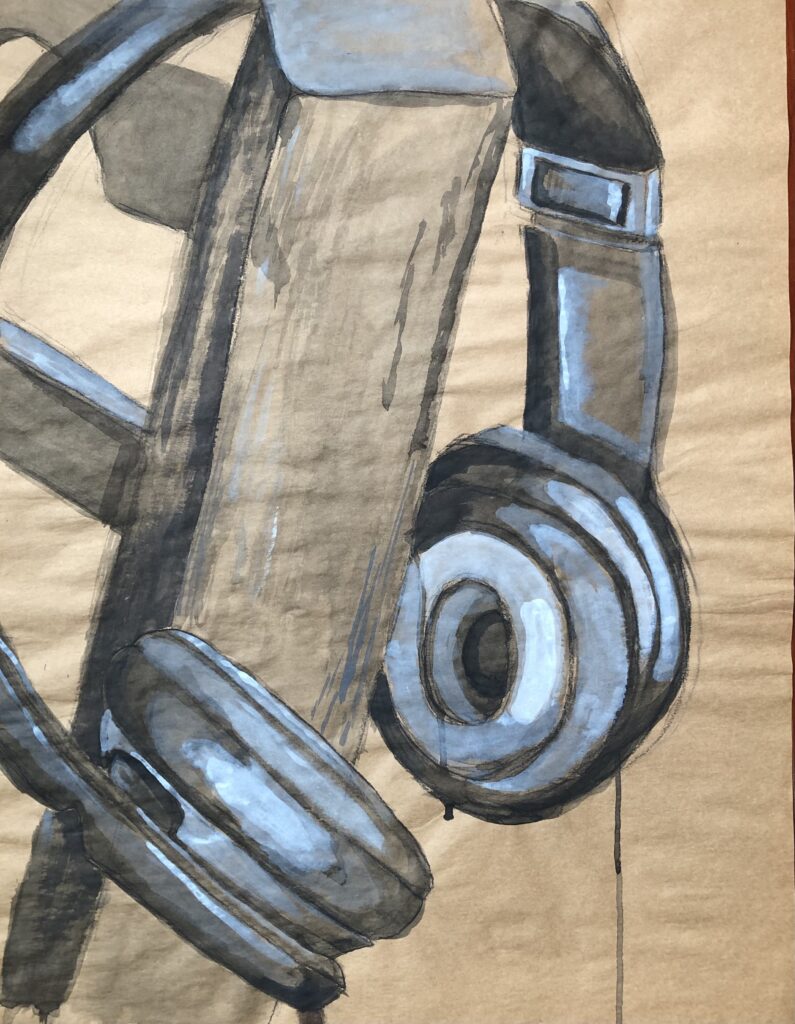
Strung Together, 2023
This piece is is made up of five different works which are connected through line, shadow and form.